
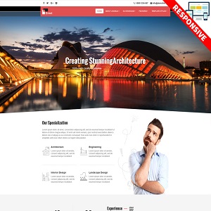
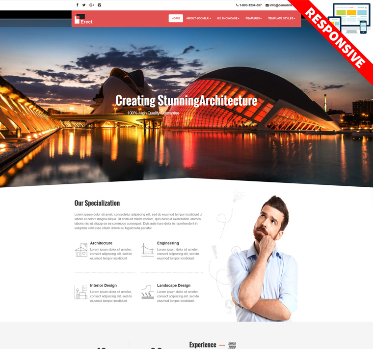
VT Erect 1.2
This template looks like a freshly finished new futuristic house – with white walls inside and lots of free space. And it is just what an architecture company needs – their website has to make visitors want to build a new building. The template pack includes a number of useful tools. First of all – interesting animation effects, that makes the viewer stay longer and read more carefully. The team block allows you to show the human face of your company and testimonials block will help to increase visitor’s trust.

Features Spotlight
This template framework have predefined features and options that you can use for faster template development. It is extremely simple and ready to use just after the installation.
Drag & Drop Layout Builder
Create your own custom layout with no coding experience by using Drag & Drop Layout Builder. It allows you to create any number of stunning and unique layouts up to 5x faster than traditional ways.
FontAwesome Icons Integration
FontAwesome Icons gives you scalable vector icons that can instantly be customized size, color, drop shadow, and anything that can be done with the power of CSS. Scalable vector graphics means every icon looks awesome at any size.
Boxed & Wide Layouts
One mouse click and you will change the layout from Wide(Full) to boxed. This can be done from theme admin panel. Boxed layout has additional options to manage background colors, patents, images…
HTML5 & CSS3 animations
This template framework comes with HTML5 & CSS3, a lot of thought and care went into the template making it a pleasure to use. You can utilize its support with direct transformation of animation.
Cross-Browser Support
The template looks great on the browsers people use: IE10+, Edge, Firefox, Safari, Chrome, Mobile Safari, the Android Browser and Chrome for Android.
Search Engine Optimized
A lot of people boast about search engine optimization. We actually have data to back it up. This template framework is built with SEO best practices in mind, so everything is prepared for you, to ship thousands of visitors to your site.
Bootstrap Integration
Bootstrap is a sleek, intuitive, and powerful front-end framework for faster and easier web development.
Responsive Web Design
The template is a fully responsive template, which means it adapts to the screen resolution of the device it is being viewed on. Your website will be equally usable and good-looking whether it is being viewed on large monitors, laptops, tablet devices, and smartphones.
Tons of Widgets
We carefully handcrafted this template with a strong focus on typography, usability and overall user-experience. This template delivers the widgets you need in spades, letting you quickly and easily put together great content and sharp layouts.
Menu and Off-canvas
Menu and Off-canvas are highlight features in this template Framework. It allows you to build up a powerful menu system and you are full control. You can create a vertical, horizontal or overlay responsive menu with many custom styles and effects.
Advanced Template Admin
This template comes with an extremely advanced admin panel allowing users to quickly and easy customize the template including Basic manager, Layout Builder, Google Fonts, Preset Style…
Built-in Google Fonts
You have full control on website’s text font. And you can change the font whenever you want with the integration of Google Fonts & Edge web Fonts. 500+ web fonts to choose and they will work correctly in all modern browsers.
Clean Code
This conforms to industry best practices at all levels. The attention to detail given by our developers on all levels is absolutely unparalleled.
Unlimited Colors
Several template settings allows you to choose your own colors. Beyond that using custom CSS allows you to override all used color presets.
نوشتن دیدگاه